Industry
Law Company
Client
Karolina Biskup
A scalable and functional branding project inspired by the city of Łódź.
A scalable and functional branding project inspired by the city of Łódź.
A scalable and functional branding project inspired by the city of Łódź.
The visual identity combines minimalist design, a refined color palette inspired by Łódź, and cohesive brand elements to convey the law firm’s professionalism, local character, and modern elegance.
The visual identity combines minimalist design, a refined color palette inspired by Łódź, and cohesive brand elements to convey the law firm’s professionalism, local character, and modern elegance.
The visual identity combines minimalist design, a refined color palette inspired by Łódź, and cohesive brand elements to convey the law firm’s professionalism, local character, and modern elegance.
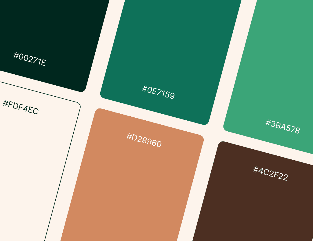
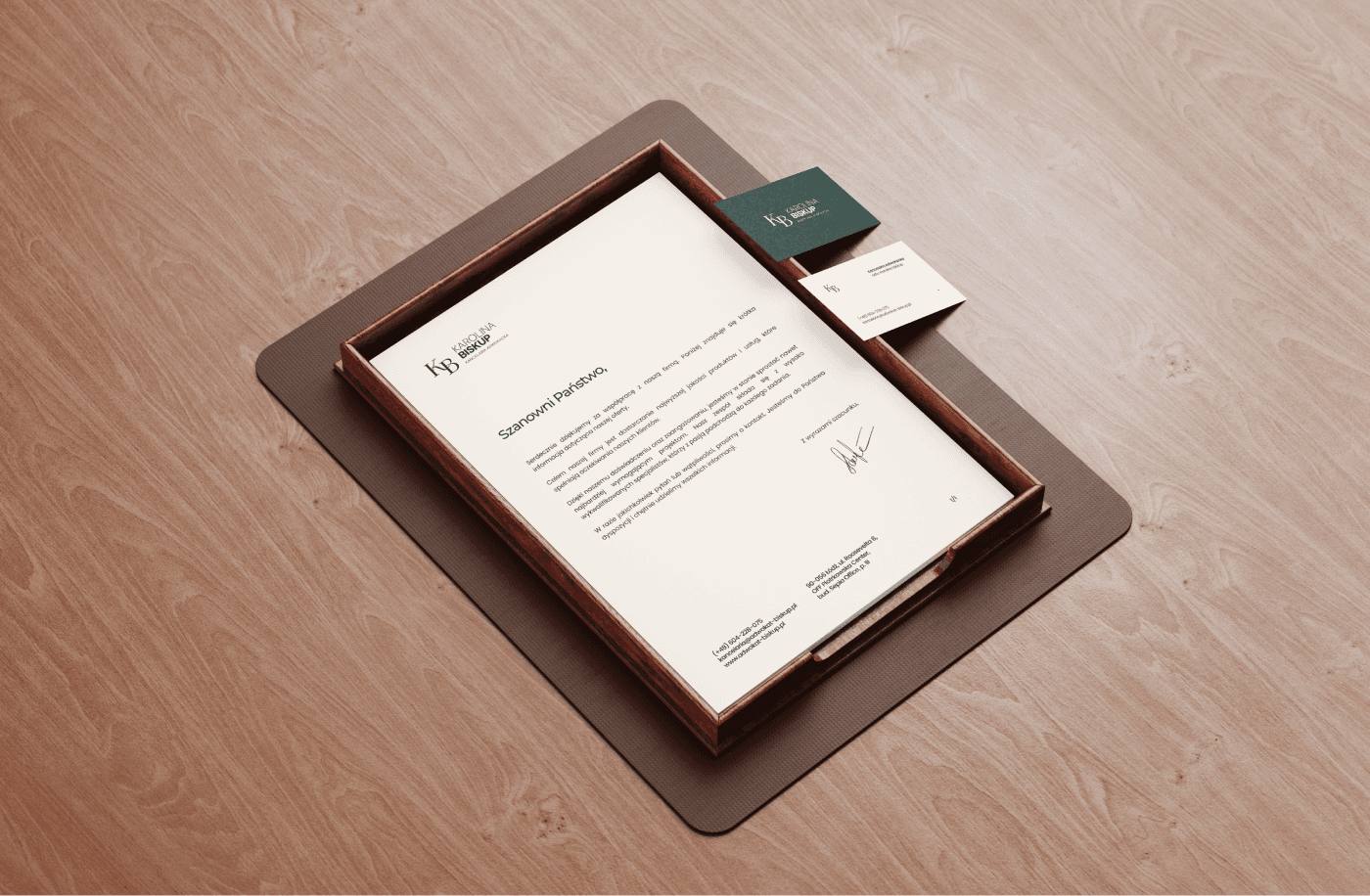
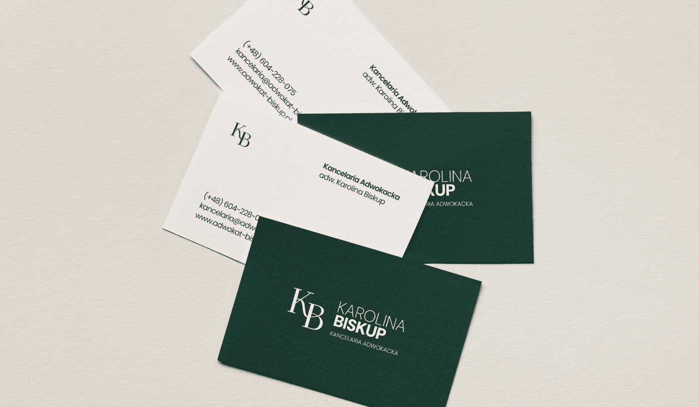
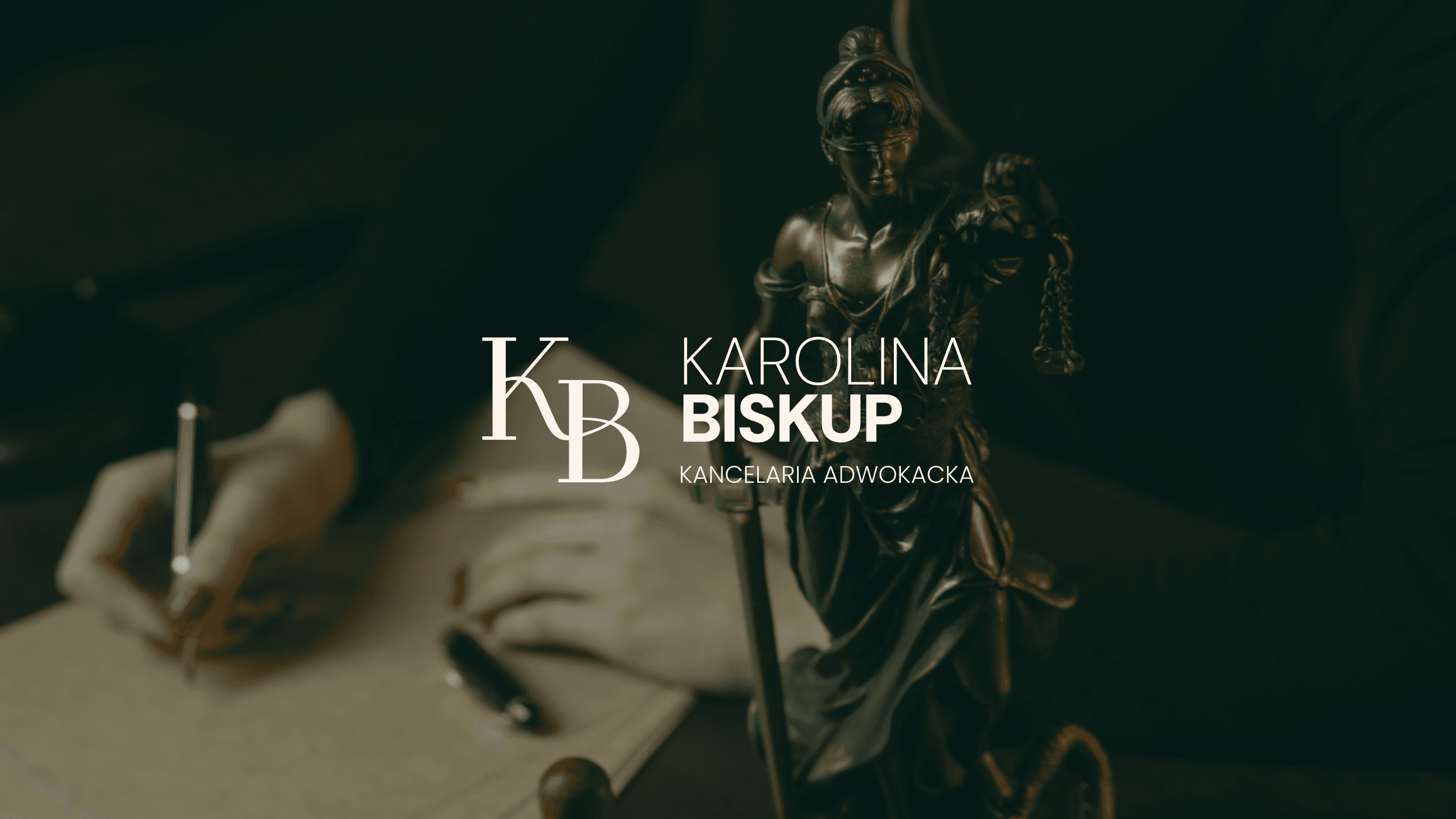
The key objective was to reflect the professionalism and trust that lawyers build through their work. The main graphic elements follow a minimalist approach — a logo in the form of a monogram composed of initials harmonizes with a subtle, classic typeface. The color palette is a refined combination of muted greens, referencing the seriousness of the legal profession, and shades of beige and brick red, inspired by the historic architecture of Łódź. This unique choice of colors gives the identity a local character, emphasizing the firm’s connection to the city. Additional elements such as a set of icons, business cards, and letterhead maintain the minimalist, calm tone of the entire identity, creating an impression of modern elegance and unwavering reliability.
The key objective was to reflect the professionalism and trust that lawyers build through their work. The main graphic elements follow a minimalist approach — a logo in the form of a monogram composed of initials harmonizes with a subtle, classic typeface. The color palette is a refined combination of muted greens, referencing the seriousness of the legal profession, and shades of beige and brick red, inspired by the historic architecture of Łódź. This unique choice of colors gives the identity a local character, emphasizing the firm’s connection to the city. Additional elements such as a set of icons, business cards, and letterhead maintain the minimalist, calm tone of the entire identity, creating an impression of modern elegance and unwavering reliability.
The key objective was to reflect the professionalism and trust that lawyers build through their work. The main graphic elements follow a minimalist approach — a logo in the form of a monogram composed of initials harmonizes with a subtle, classic typeface. The color palette is a refined combination of muted greens, referencing the seriousness of the legal profession, and shades of beige and brick red, inspired by the historic architecture of Łódź. This unique choice of colors gives the identity a local character, emphasizing the firm’s connection to the city. Additional elements such as a set of icons, business cards, and letterhead maintain the minimalist, calm tone of the entire identity, creating an impression of modern elegance and unwavering reliability.