Industry
Handmade crafts
Client
Kvrz Ceramics
Cozy, thoughtful branding for a studio specializing in handmade ceramics.
Cozy, thoughtful branding for a studio specializing in handmade ceramics.
Cozy, thoughtful branding for a studio specializing in handmade ceramics.

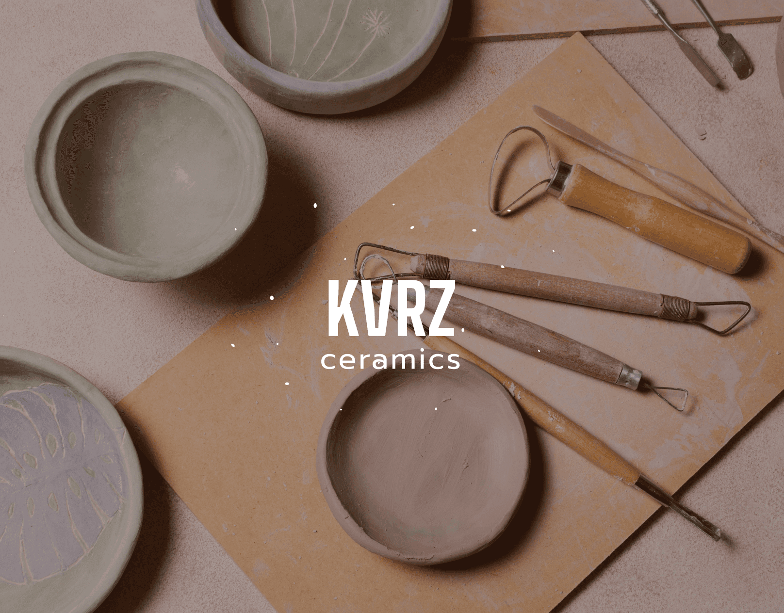
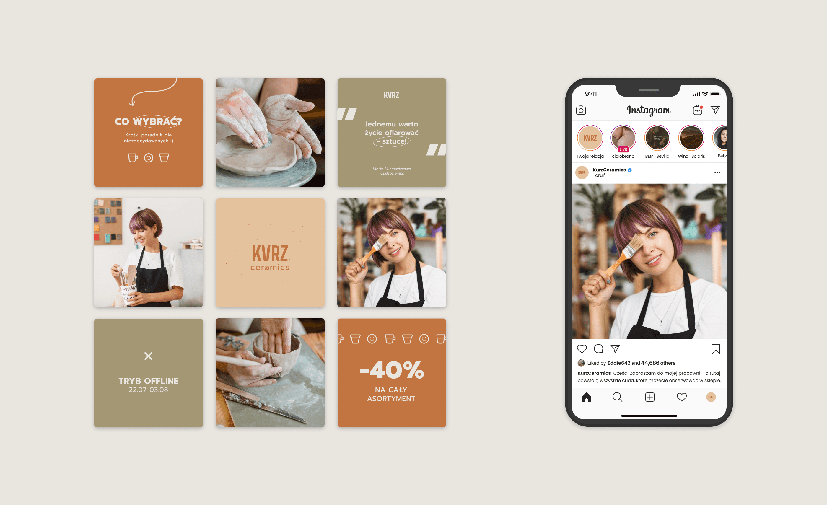
Kurz Ceramics: Branding Rooted in Simplicity, Passion, and Purpose
Kurz Ceramics: Branding Rooted in Simplicity, Passion, and Purpose
Kurz Ceramics: Branding Rooted in Simplicity, Passion, and Purpose
Kurz Ceramics is a handmade pottery studio from Toruń, Poland, created as a response to the mass production of disposable, low-quality goods. I developed a visual identity that reflects the studio’s core values — ecology, craftsmanship, and quiet optimism. Inspired by the raw beauty of stoneware clay and the honest forms of everyday ceramics, the branding embraces natural textures, muted tones, and clean typography. The result is a warm and authentic identity that honors both tradition and intention, resonating with conscious consumers and lovers of timeless design.
Kurz Ceramics is a handmade pottery studio from Toruń, Poland, created as a response to the mass production of disposable, low-quality goods. I developed a visual identity that reflects the studio’s core values — ecology, craftsmanship, and quiet optimism. Inspired by the raw beauty of stoneware clay and the honest forms of everyday ceramics, the branding embraces natural textures, muted tones, and clean typography. The result is a warm and authentic identity that honors both tradition and intention, resonating with conscious consumers and lovers of timeless design.
Kurz Ceramics is a handmade pottery studio from Toruń, Poland, created as a response to the mass production of disposable, low-quality goods. I developed a visual identity that reflects the studio’s core values — ecology, craftsmanship, and quiet optimism. Inspired by the raw beauty of stoneware clay and the honest forms of everyday ceramics, the branding embraces natural textures, muted tones, and clean typography. The result is a warm and authentic identity that honors both tradition and intention, resonating with conscious consumers and lovers of timeless design.